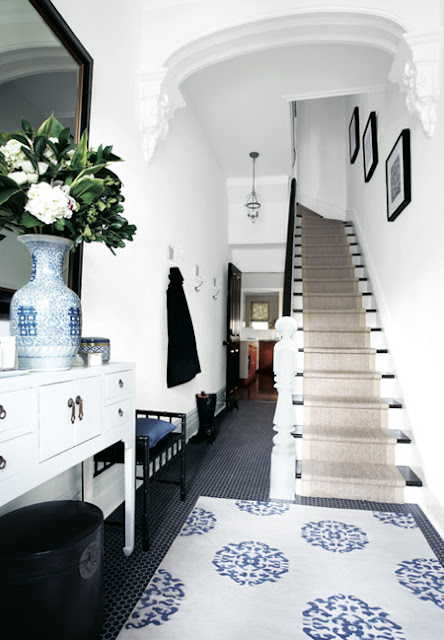
What do you think? Which of these entry halls do you like best...simple "less is more decor" foyer above...or the decked out designed foyer below.
Which would you want to come home to every day?
I love the wide plank wood floors, the pale blue front door and the paneled walls in the first photo.
I also really like the black penny round tile floors, sisal stair case runner, the black framed art and mirrors and the great Madeline Weinrib rug in the photo below.
Hmmm...thinking.
So...which do you prefer...I have my pick...once you weigh in I'll let you know what I think tomorrow.
Comment below please!
Happy Monday!
xo
Coco
Photos: Alex James Photography; House & Home
You have read this articleentrance /
entry hall /
foyer /
front door /
stairs /
THIS OR THAT
with the title THIS OR THAT - FOYER DESIGN. You can bookmark this page URL http://nbaynadamas.blogspot.com/2013/05/this-or-that-foyer-design.html. Thanks!
Write by:
AN - Monday, May 13, 2013


Comments "THIS OR THAT - FOYER DESIGN"
Post a Comment